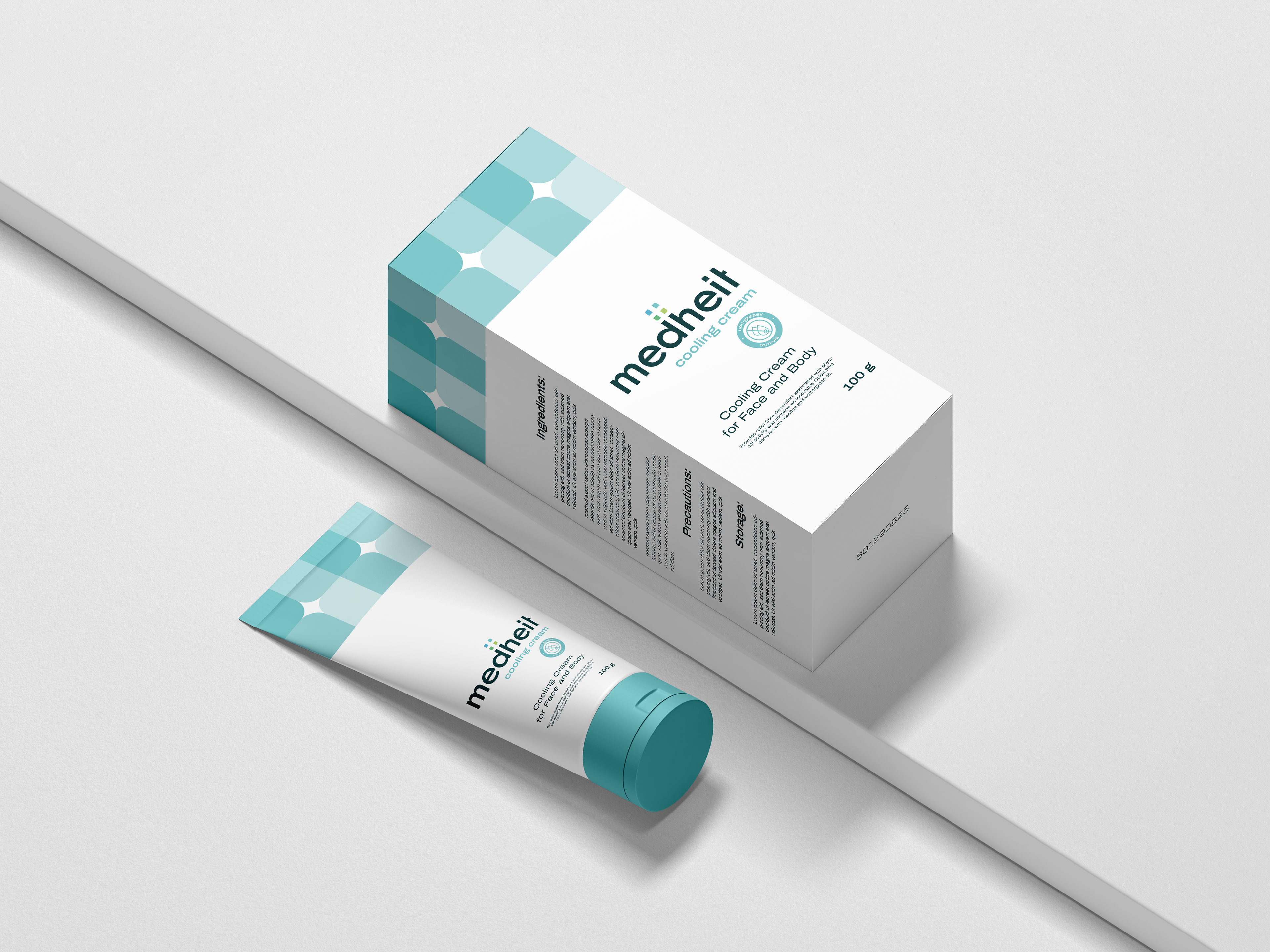
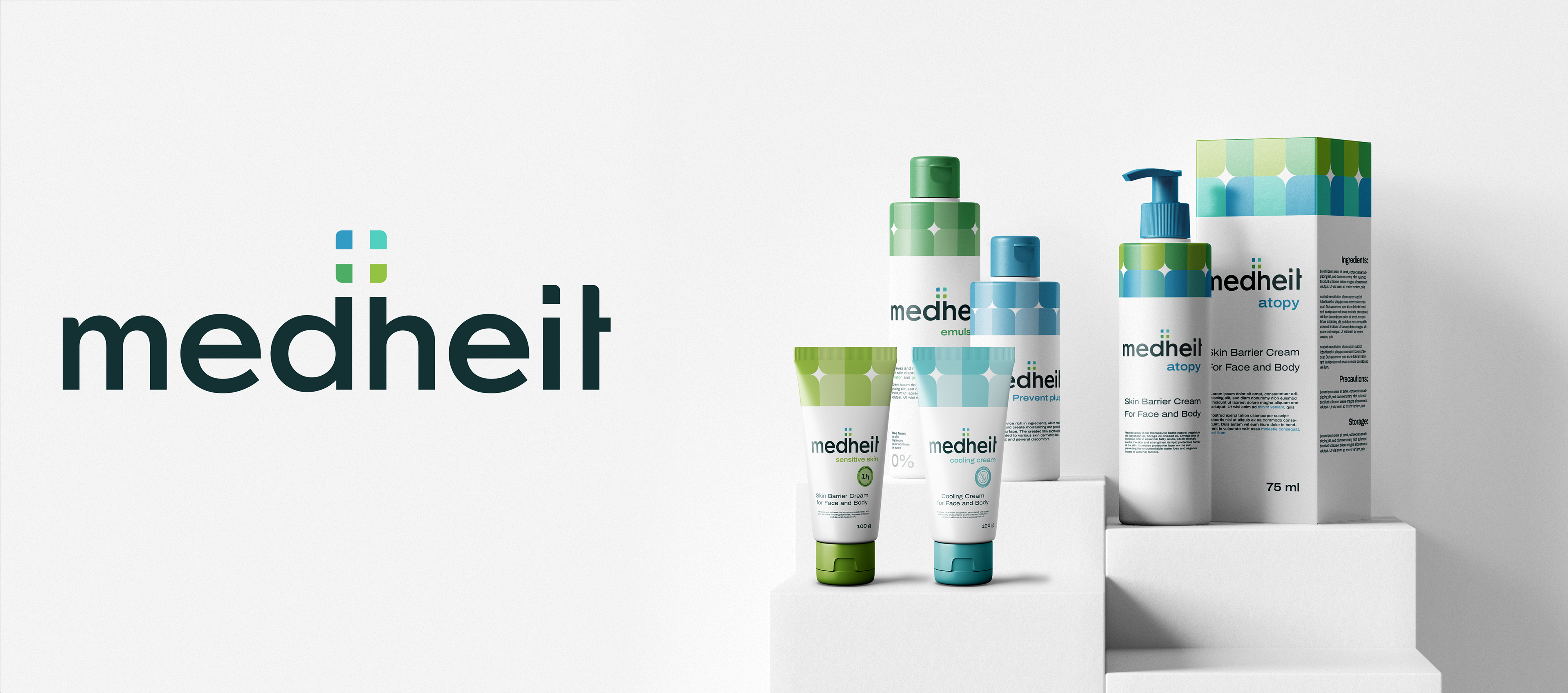
In mid-2024, I had the exciting opportunity to design a brand identity for 'Medheit', an innovative healthcare product line. The name 'Medheit' combines 'medicine' and 'safety', encapsulating the brand's core values of healthcare, innovation, empathy, and trust. Medheit's mission is to provide innovative, natural, and long-lasting healthcare solutions for the entire family.
The brand's visual identity strikes a balance between friendliness and professionalism, blending geometric shapes with clean, modern typography. This approach resonates with Medheit's target audience: adults and families seeking unique, high-quality healthcare products.
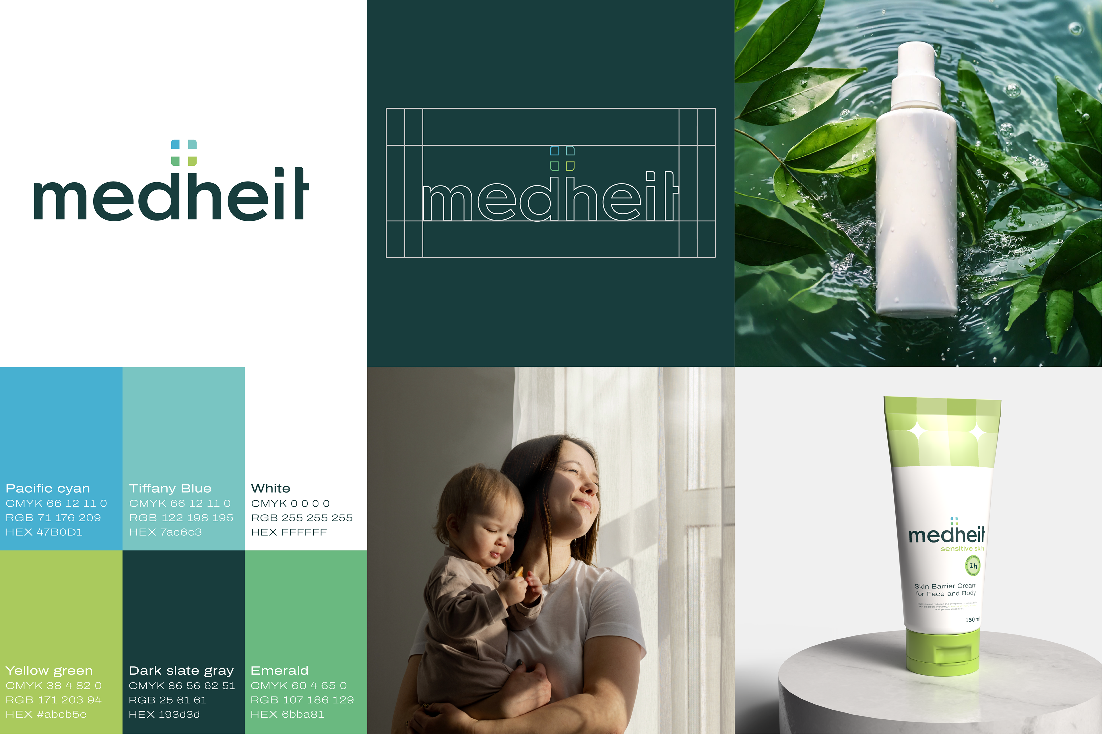
To establish a strong market presence, I developed a clear positioning strategy centered on the pillars of trust, innovation, and wellness. These values served as the foundation for crafting a cohesive visual color scheme and packaging system.
To establish a strong market presence, I developed a clear positioning strategy centered on the pillars of trust, innovation, and wellness. These values served as the foundation for crafting a cohesive visual color scheme and packaging system.
By aligning the brand's visual elements with its core values, I created a compelling identity that speaks directly to consumers looking for reliable, innovative healthcare solutions. The design ensures that Medheit's products are instantly recognizable on shelves, reinforcing the brand's promise of quality and care
______________________
Client: Agrezor International GmbH

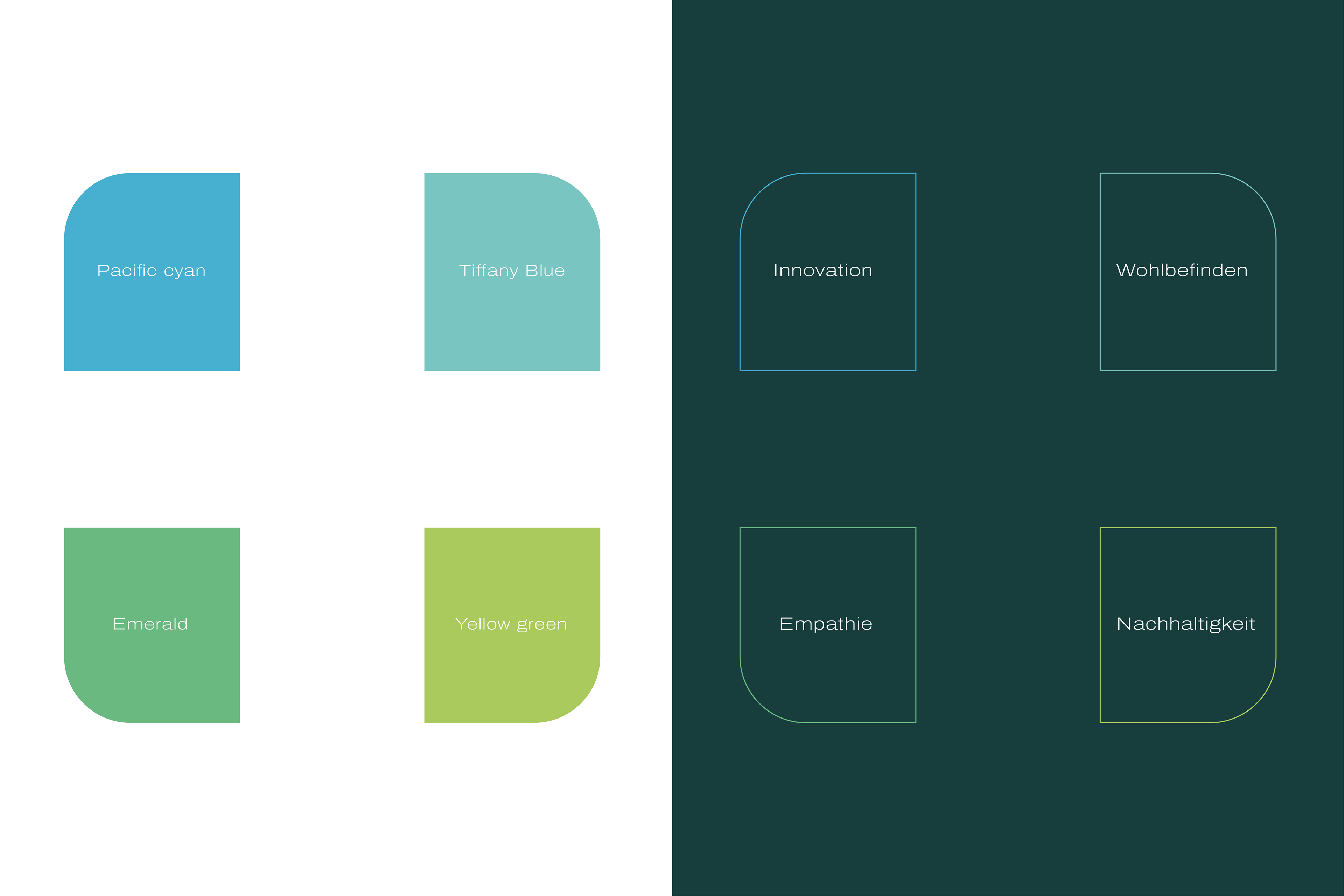
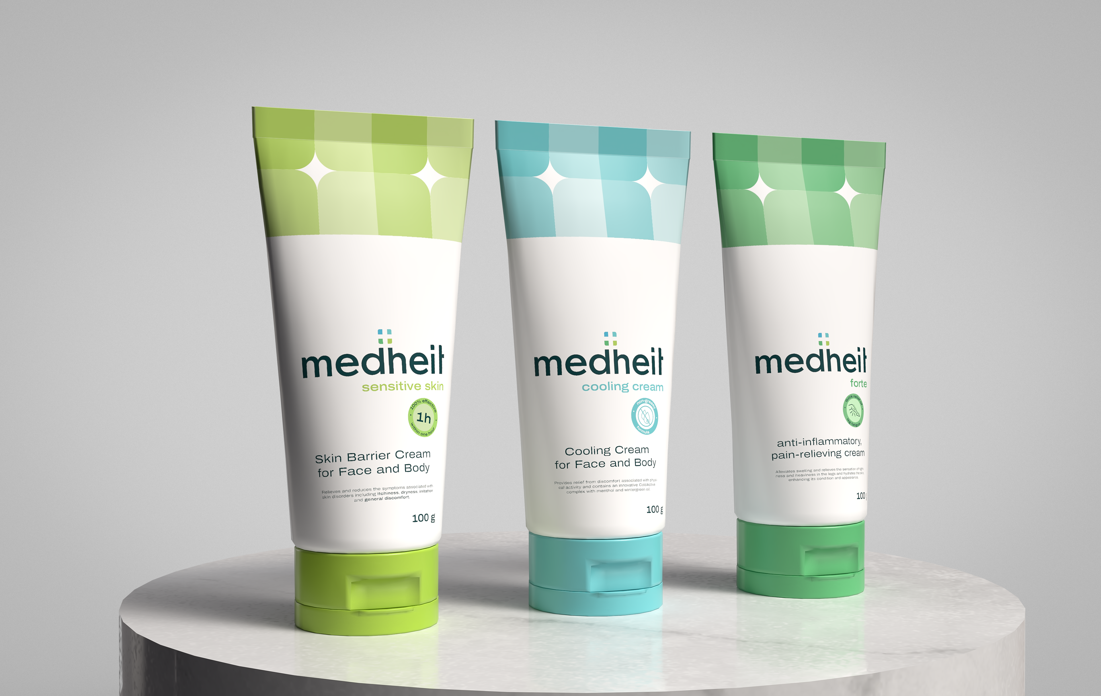
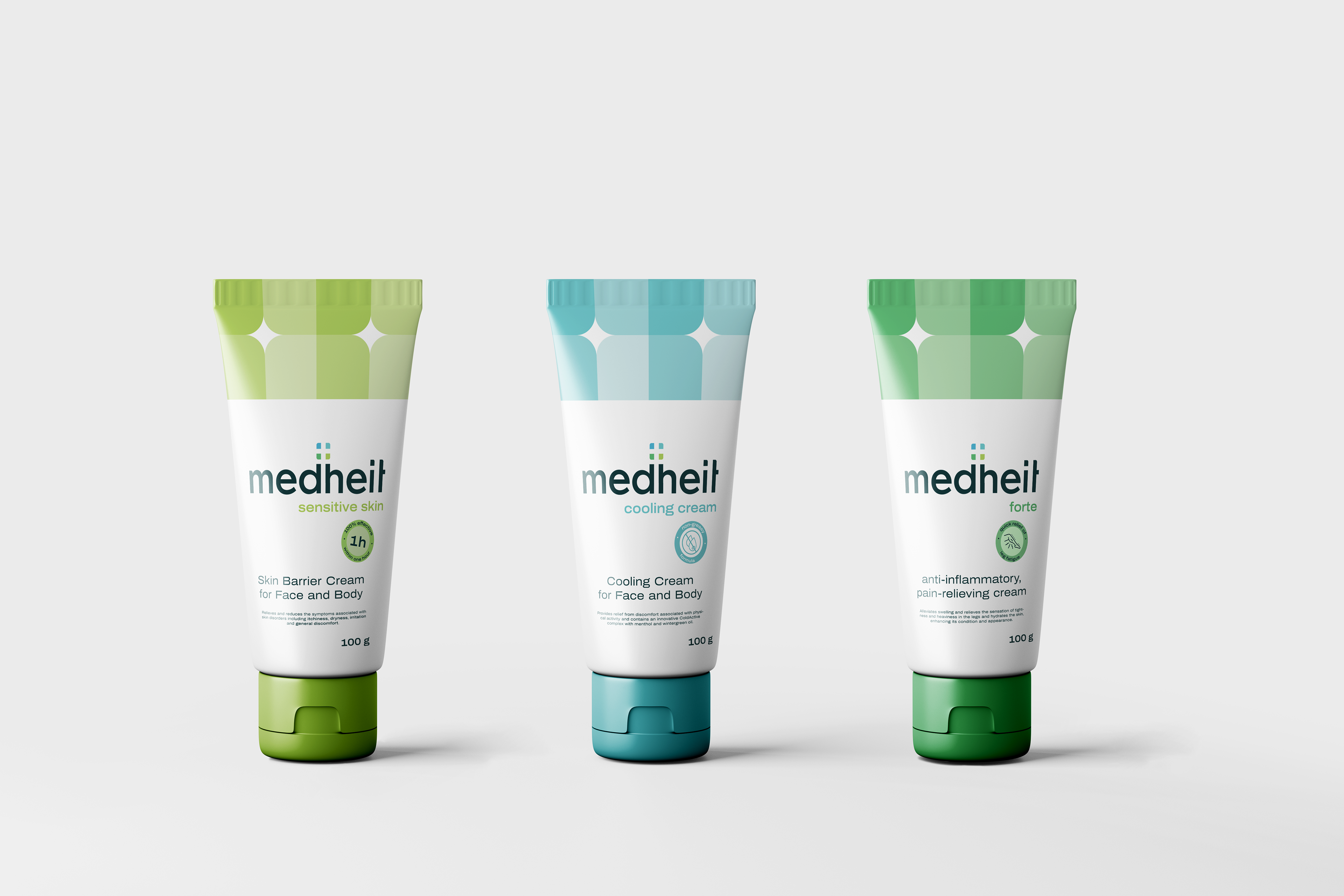
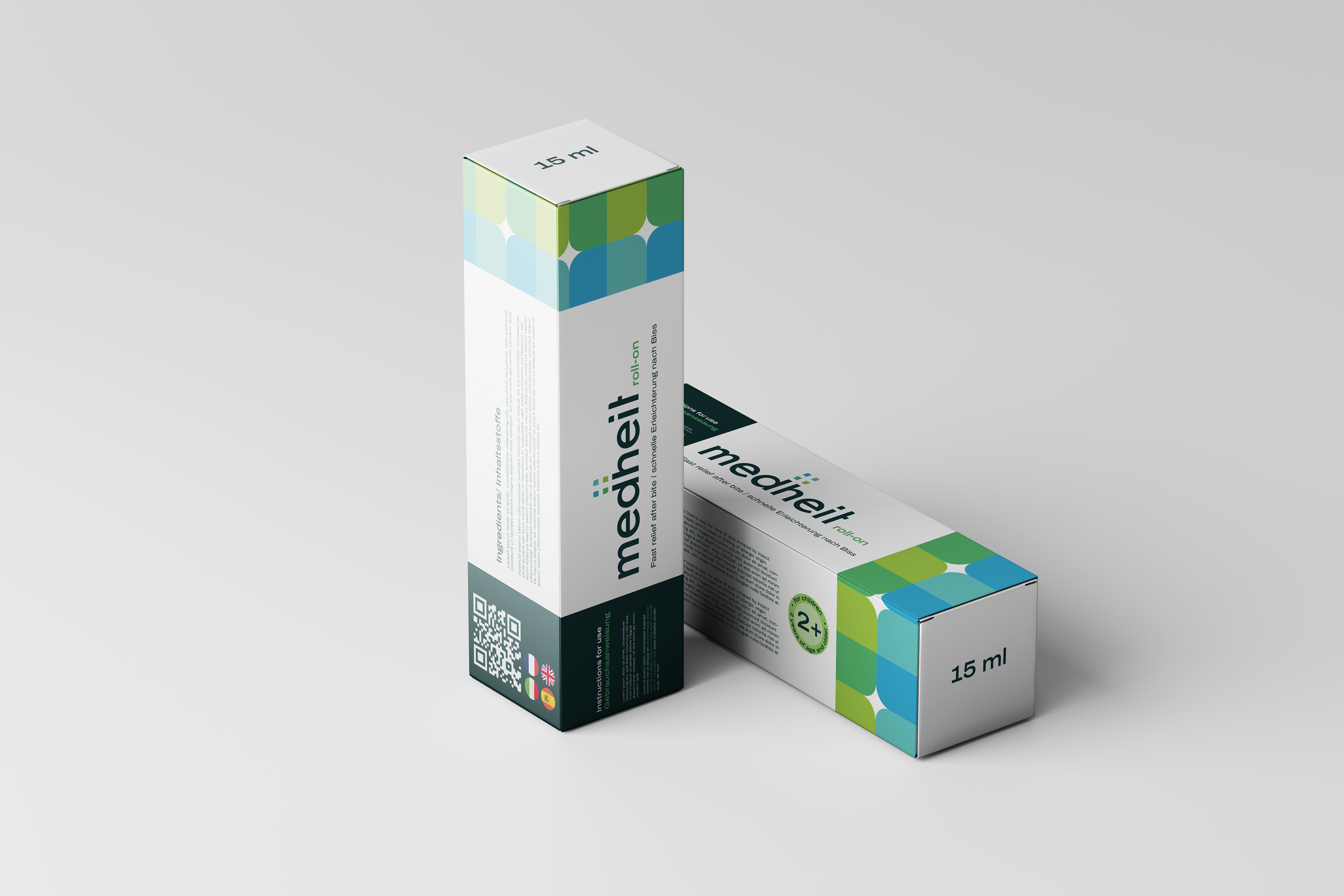
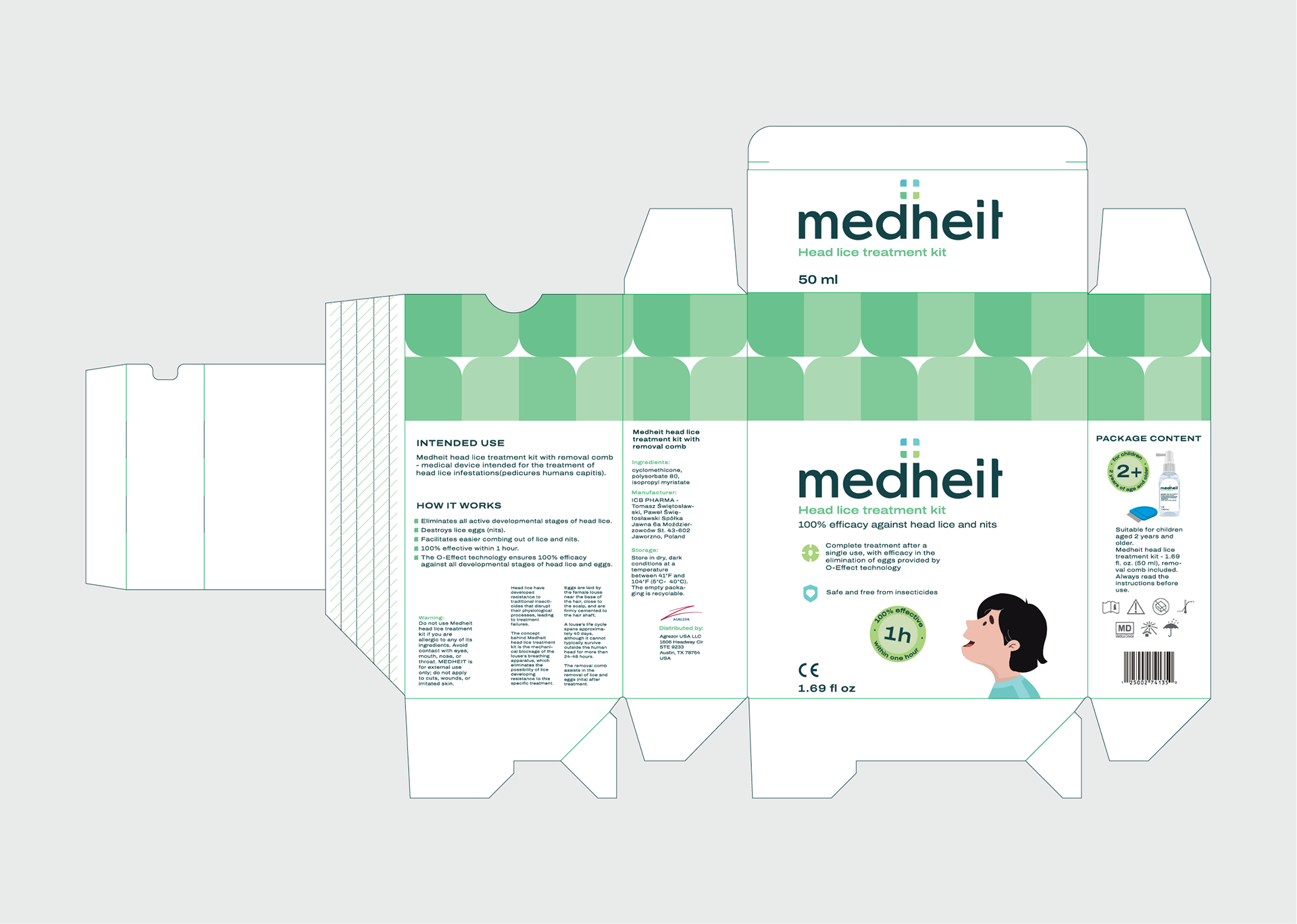
Colour System Design
To differentiate product categories and lines clearly, I developed a color system based on gradients derived from the logo's four primary colors. These gradients are organized into a scale of intensities: 80%, 60%, 40%, and 20%.
This design ensures visual consistency while providing an intuitive method for categorization. Each gradient corresponds to a specific product category, enabling consumers to quickly identify and distinguish between different offerings within the Medheit brand.
The color gradation enhances brand recognition, simplifies product navigation, and maintains a cohesive visual language. The result is a clean, modern system that embodies the brand's commitment to clarity and innovation.